Creating a brand identity for a Wound Clinic

B. Braun Medical Estonia’s new Wound Clinic service lacked an identity and a way for people to connect with it

Service design in healthcare
The Wound Clinic (Haavakliinik) service provides specialized care for wounds, filling a gap in the Estonian market for healthcare services. Wounds can have many causes, some more difficult to identify than others, and finding effective treatment is not always easy. The state-run process can be slow and often unreachable as the state healthcare system doesn’t provide many options for patients. Consequently, a specialized clinic could offer much needed relief to people, especially those with traumas or chronic conditions.
We had previously worked with the Wound Clinic to define their customers’ needs, designing their customer journey and mapping out what activities were necessary to launch this new service, along with concepts for digital solutions. At this point, the clinic even had dedicated people ready to run it, but the work was incomplete.
Services need to engage people on an emotional level and speak to them in more ways than just function. This is what identity is about.
A service identity is usually attributed to a brand – its logo, colors, overall style. But as a brand is also about communication, it’s essential to know what to communicate, especially with medical service providers, since clients expect these to be trustworthy. But trust isn’t easily earned.

Approach: Begin with core values
We started with defining the core values of the Wound Clinic. This process isn’t easy – it’s where many companies stumble, since it requires many discussions and agreements that rely on everybody being on the same page.
With the Wound Clinic, budget and time were a major concern. They had a small budget for the project and, as most stakeholders from the client side are active medical professionals, they didn’t have much time to spare. The project was allotted approximately one month to be completed, from start to finish. Because of the tight timetable, we began by organizing a workshop for all of the stakeholders. Through an intensive set of exercises, we laid the foundation for their entire identity in six hours.
There were challenges involved in softening the harsh reality of wounds
It was a challenge to put together an attractive brand for the Wound Clinic, since wound care is not an attractive topic – it’s associated with stitches, blood, and pain. People have no positive connections with wound care, so the focus was to find a way to create a feeling of trust and safety in potential patients.
After the workshop, our client knew how to engage patients with their new service and make it a part of their lives. The last step was to finalize the visual component of the brand by defining the brand’s colors, logo, typography and other key elements.
Result: The logo says it all
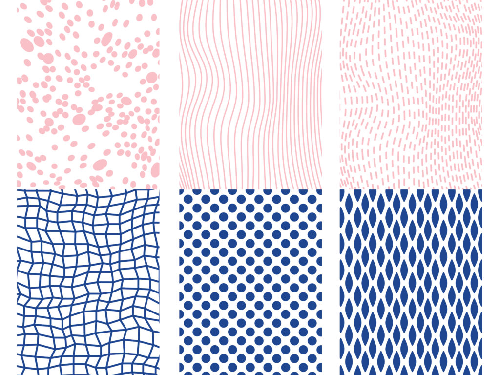
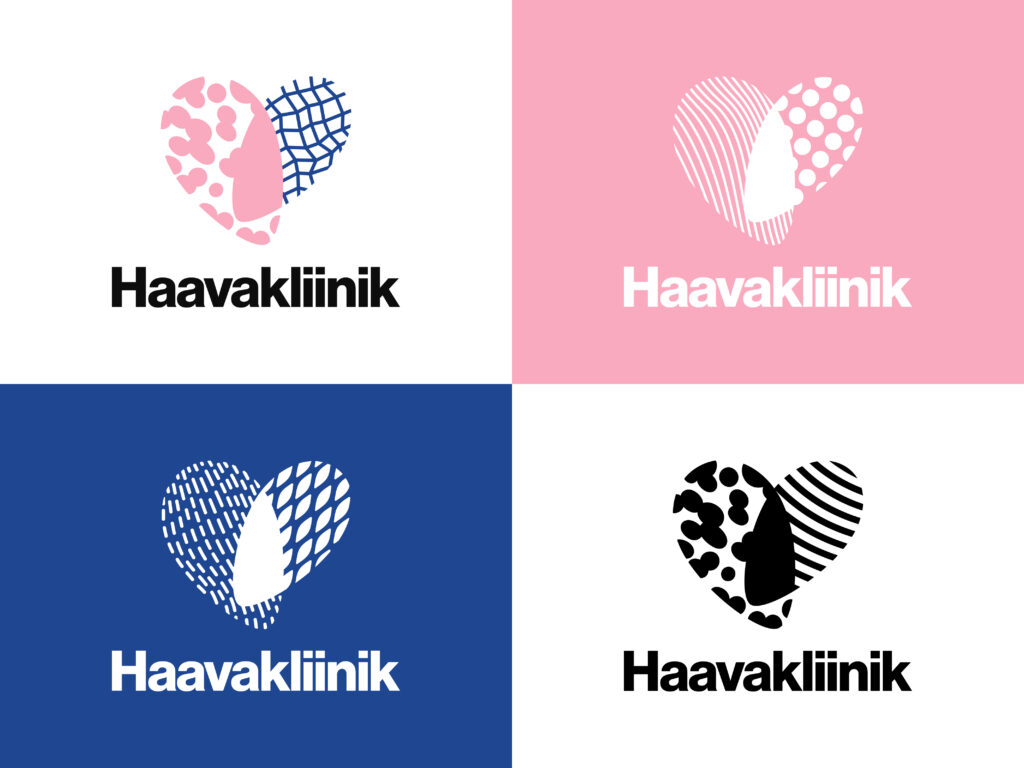
For the brand, we focused on the caring attitude and personalized treatment the Wound Clinic offers. The colors chosen were a soft combination of pink (representing the patient) and blue (representing the care). The patterns of both colors change to represent that each person receives the care that fits them the best. The patterns come together to form a filled-in whole in the middle – the holistic care that takes place in the Wound Clinic.
By helping our client define the core values of the Wound Clinic service, the stakeholders of the company now had guidelines to steer future operations. The guidelines have helped to keep them focused on providing the highest quality of service possible. The brand establishes the Wound Clinic as a trustworthy and caring place, ensuring that patients don’t turn away from the service because of fears or anxiety.

Related case studies
Our case studies give an insight into how human-oriented design principles will help product companies persuade customers to go on a journey with smart, connected products.
Share your challenge with us
Thank You!
Your message has been sent. Our team will get back to you as soon as possible!


