Service design as a tool to rethink your service
Taavi Aher is a digital product designer, and Geroli Peedu is a lead service designer at Proekspert.
Proekspert’s service design project for internet.ee was a nominee for the Estonian Design Award 2018 in the service design category.
As designers we often get approached by friends who ask whether they should keep the existing materials on their site and how to organise it all. Many organisations are familiar with the situation when their web environment, once compact and easy to understand, has grown over time. At some point, the vast quantity of information and materials makes it difficult to quickly find what’s relevant.
We started the design project for the Estonian Internet Foundation with a similar challenge. The Foundation handles the management of Estonia’s top-level domain .ee, its sub-domains, and shares information regarding the .ee country domain. For managing the registration of domain names and sharing information about the domain rules, the Foundation had six different current- and planned web environments gathered under the domain internet.ee.
The foundation wanted to revamp all of its existing services and to unify the user experience. Each of the environments had been developed at a different point in time and therefore were inconsistent in structure and development phase. They needed help in figuring out how everything should work.
We used service design to understand the users and current services, to form new ideas, and validate our design solution.
User study
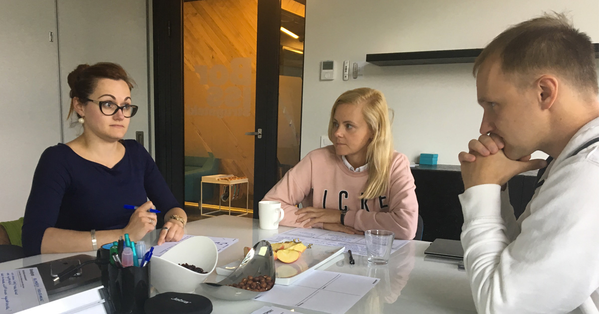
Once we began working, our first challenge was to define the main user groups. Our goal was to understand who were the real users and which kinds of services they needed. During the co-creation workshop with the client, we mapped all possible user groups, their interests and needs. This turned out to be quite challenging, as we were dealing with a very niche service. We managed to get six clearly defined groups, of which we defined two as main user groups.

Co-creation workshop
This information held great value for us, but we needed to dig deeper. For the design of a supreme user experience, knowledge of what users need is not enough. We needed to understand how users felt and related to things. We wanted to understand the feelings behind the needs.
To gain a deeper understanding of users, the method to be used is personas. Based on client input, we assembled two personas: potential domain registrant and domain registrar. The personas became the focus point of the service design. We used the personas as a tool to discuss design decisions made during development. In addition to the basic information about problems, an important part of the personas were the needs and pain-points of the users.
Untangling the mess in service design
We quickly ran into the next challenge. The information architecture of the current services was incomprehensible. The navigation was full of links which directed users to a variety of different pages where they were met by more links. To gain clear picture of how big our challenge was, we created a comprehensive map of all existing environments.

Untangling the mess
Next, we wanted to understand how users navigate in the environments. So based on the personas we defined main user journeys and conducted user testing with potential domain registrants—75 tests in total.
Before and after: information visibility increased from 30 to 75 percent.

Running user interviews
The test results showed the need to simplify user flows and create a new service map. The situation was improved – information visibility was increased from 30% to 75%. There was still room for improvement, but we had enough insight to further improve the architecture. Finally, we were ready to move on to the idea generation and design stage.
Forming ideas
The basis for our new ideas were insights gathered by conducting user research and untangling the mess of existing services. Based on that, we defined the following design principles as the basis for further development:
- Less is more – the fewer environments, the easier to navigate and not to get lost.
- Simple copywriting – users are not familiar with niche terminology. We must keep the language of service simple to understand for end users.
- Focus – we gather relevant info to a single page, rather than scattering it across different pages which will confuse users.
- Highlight important – users want to see what’s important to them first.
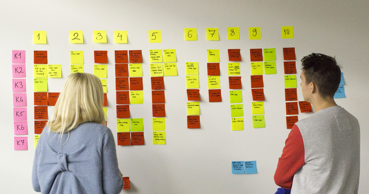
Doing on-site analysis
The first design sketches we made on paper. Then we continued wireframing in UXPin, which allows the creation of large-scale and responsive prototypes.
Validation and improvement
We began collecting feedback as soon as the first design’s draft was ready. We contacted 10 online interviews with users chosen based on personas. The interviewer saw video of the user and their screen. At the same time, observers took notes and recorded comments. This kind of on-site analysis method allowed us to save resources and avoid otherwise time-consuming transcription and analysis.
The feedback pointed to the main shortcomings related to terminology and user flows which we could improve in future iterations. Once the prototype was completed, we ran usability testing with seven users. The results proved the clarity and improved satisfaction with the service.
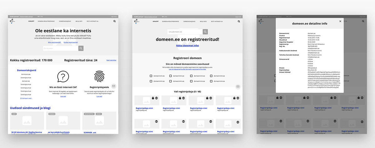
Wireframe examples
Outcomes from the project:
- Clearly distinguished information directed at two different user groups – domain registrants and registrars.
- Number of different environments reduced from six to two, which allowed users to navigate more easily and find what’s important to them.
- New information architecture greatly improved information visibility (success rate increased from 30 to 75 percent).
- Enhanced convenience and flexibility of service administration.
To summarise – using service design tools
Using service design tools helped us understand who users really were and what they needed from the service. Also, while running the interviews we were able to grow empathy towards the users.
Contact Us
If you would like to discuss it further, contact us or join our newsletter.
About Proekspert
Proekspert is a skilled software development company with over 30 years of experience. We have encountered many diverse approaches to equipment, software engineering, and cybersecurity. Our expertise covers embedded software, device-cloud integrations, technician apps, and portals.


